News
Clown on Slipknot’s year ahead: “We got a new album”
Clown is looking ahead to a 2025 that includes “no complaining” and a new record – but he doesn’t mean Look Outside Your Window, which he says was “never a Slipknot album”.
Here are 12 awesome albums whose cover art makes us cringe.
Although some bands are incredibly adept musicians and performers, their artistic sensibilities don’t necessarily translate into the visual realm. There’s no guarantee that your favorite thrash shredder has the same taste in paintings as they do pentatonic solos, and occasionally that gets displayed in really obvious ways. Some of the best albums in rock’s history are matched with some truly embarrassing album covers. Whether it’s a cringeworthy Photoshop job, a bevy of competing ideas all thrown into one, or some straight-up corny art design, there’ve been a lot of great records tucked inside not-so-great sleeves.
Here are 12 awesome albums with accompanying artwork that ranges from weirdly out-of-place to downright asinine…
City Of Evil is Avenged Sevenfold’s most virtuosic album, a balls-to-the-wall embrace of thrash and metalcore that proved their half-life would extend far beyond the NWOAHM. To this day, it features some of A7X's best performances… but its cover art is literally cartoonishly bad. For whatever reason, the band decided to turn their Deathbat logo into an anthropomorphic skeleton knight that, despite having wings, rides some sort of hell stallion with a mile’s worth of entrails leaking behind it? It only becomes more confusing the more you look at it. The band seemed to get the message, though, as they returned to their OG logo for the next project and pretended that this never happened.
READ THIS: Avenged Sevenfold reflect on Bat Country: "It was the song that changed it all"
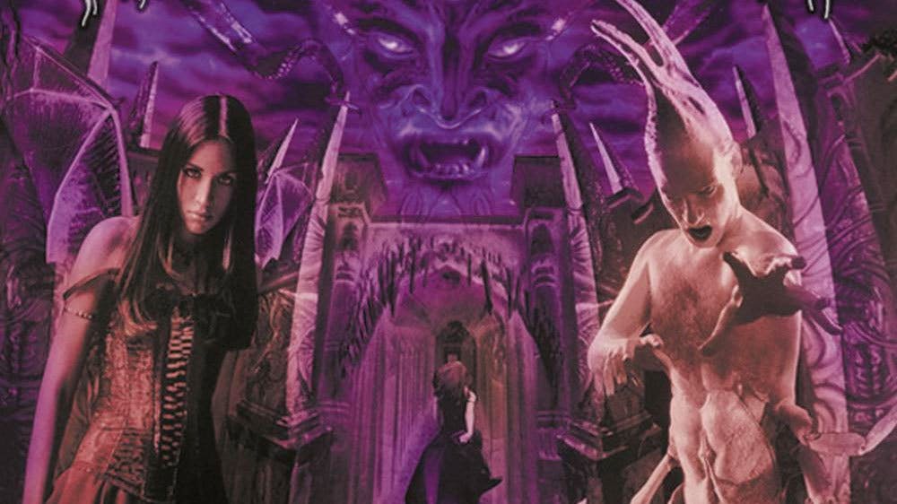
For goth metal purists Cradle Of Filth’s Midian is an essential contribution in the extreme music lexicon, despite its album artwork being hilariously absurd. From the B-movie bug critter on the right of the image and the horrendous photoshop job (by current standards, at least), to the overdramatic glare from the winged woman on the right, it could easily pass for parody. Then again, the album was a huge turning point for the band, so perhaps hindsight is always 20/20.
Darkness Descends, the sophomore album by brutal thrashers Dark Angel, sounds as evil today as it did in 1986. But its album art lost whatever shred of terror it might’ve conjured when it dropped. It genuinely looks like there were two entirely different ideas for where to the take the cover, and the warring parties resolved their conflict by merging their polarizing concepts into one. The is like a still from a bad zombie film with a poor parody of Iron Maiden's Eddie in the middle. And even if the photo did look amazing, there are hands rising out of the ground -- which is the opposite of descending. Good thing the record rips.
Ho boy. New Found Glory’s Catalyst is a staple of mid-’00s pop-punk, and your favorite band from the genre’s current crop probably wouldn’t exist without this thing. That being said, its album artwork is seriously deranged, like an ad for some sort of free-to-play Sims ripoff that’s marketed toward mall goths. It also has seemingly no relation to the actual album itself, so why even go here? The disturbing butler guy is terrifying, and it’s unclear whether any of the childlike figurines are supposed to be members of the band. Just ignore it and crank All Downhill From Here.
READ THIS: The 51 greatest pop-punk albums of all time
Master Killer is heavily responsible for injecting metal into the hardcore scene, cementing Merauder as one of metalcore's forefathers. The album remains a highly influential record for any metallic hardcore band of the day, but it also has an extraordinarily cringe-worthy and dated cover. Beyond the questionable appropriation of East-Asian samurai imagery, the roided-out figure thereon looks like some bonkers fan art of Jim Carey’s The Mask as a bodybuilder. It’s really dopey, but don’t let it turn you off from the pummeling riff-storm that is this album.
The thrash lords’ fifth album is full of bleak subject matter and a tastefully refined version of the sound they established in the prior decade. That said, its cover art is absolutely ludicrous. The hastily-drawn clock adorned with skulls is not just corny, but improperly scaled. The length of the skeleton arms would clearly extend beyond the boney heads in place of numbers, which is incredibly frustrating for the aesthetically neurotic. But what’s even worse is the supposed reflection of the clock in the water beside it: the inverted version of the Anthrax logo doesn’t even match the orientation of the graphic it's reflecting. Don't even get us started on the back cover art.
Nearly everything about At The Gates’ melodic death metal opus Slaughter Of The Soul holds up nearly 25 years since its release. Well, everything but its cover art, which uses the infamously corny Papyrus font and looks like a graphic from a stuffy History Channel documentary from the mid-'90s about Discovering The Truth Behind Jesus. The font and the color scheme make this thing look ancient (and not in the way they were intending), but holy shit, this record still hits incredibly hard.
Lamb Of God’s titanic variant of groovy metalcore has been consistently great since the early 2000’s, and their album covers have been reliably less-than-great. For whatever reason this band has switched from compelling cover illustration to a tattered, crumbly art style that’s weirdly incompatible with their mighty, in-the-pocket playstyle. LoG's 2006 album Sacrament brought them to radio-metal acclaim, but its album cover looks like a grainy still from an early-2000’s video game. The album sounds great in 2019, but the cover looks like it was dated before it was even released.
The album title says it best. Exodus’ third record begins with a menacing spoken-word intro about prison injustice, and then kicks into some of the gnarliest thrash of the decade. But its album cover looks like a promo photo from the inside jacket of a Mötley Crüe record. Its silliness is a cheap juxtaposition to the actual music thereon, and in an era when people were forced to thumb through LP’s to find new favorites, there’s no way this didn’t turn off a hefty portion of prospective fans.
Deftones’ 1997 breakout Around The Fur is a landmark for nu-metal and alt-metal alike, a record that single-handedly proved that the rap-metal hybrid was capable of more than trendy edginess. That said, its album artwork succumbed to the genre’s most tastelessly hyper-masculine sensibilities, as it features a candid of a random woman who Deftones were partying with one night during the album’s creation. A few years back, Chino Moreno told Kerrang! that the cover is “horrible” and that he regrets using the image, so at least he agrees that it was a misstep.
READ THIS: Here's what the girl from the cover of Around The Fur looks like now
When a band is on their eighth record, there’s an expectation for a drop in quality that Arch Enemy succeed in avoiding on their 2011 release Khaos Legions. Its album art, on the other hand, looks like screencap from a test version of the video game Borderlands. It’s meant to be ostentatiously gruesome, but ends up looking really predictable. But hey, the band are in the business of blast beats, so we can cut them a break for this visual hiccup.
For a band whose visuals are almost as important as their music, and who’ve always had threatening album covers, the image Slipknot chose for their emotional 2014 return feels… off? Slipknot are known for their eccentric costumes, and yet the get-up the person on the cover is wearing looks like a generic skeleton outfit from Party City, while the way they’re standing against the fence is confusing. Is it a crucifixion reference? Is the way their hips are bent supposed to be sexy? For a record that leaves the band’s heartache for their fallen brother (in this case late bassist Paul Gray) out in the open, the cover art is peculiarly vague and uncharacteristically tame for Slipknot.