News
Metallica have donated $500,000 to California wildfire relief efforts
Metallica and their All Within My Hands foundation have announced that they’re granting $500,000 to relief efforts for the current Los Angeles fires.
A baker's dozen of heavy metal's greatest t-shirts. Probably not ones to wear to graduation...
Metalheads – even more than any other kinds of music fans – find it especially important to let friends and strangers know what they’re into. Band apparel can serve as a password of sorts at concerts (e.g. “Is this guy alright? …Yep, he’s wearing a Toxic Holocaust shirt.”), and some items are cool enough to inspire passersby to check out the band without any further recommendation. It’s no wonder that band merch has been a huge part of the music industry since rock and roll began.
Considering what an important role band T-shirts have played in the heavy metal history, we thought we’d round up and rank the most classic, timeless - and all-around best – T-shirts that have ever hugged a headbanger’s torso. We’ll do our best to explain how each shirt was designed, who had a hand in making it, and what makes it a metal apparel staple today.
In ascending order of awesomeness, here are the some of the greatest heavy metal shirts ever...
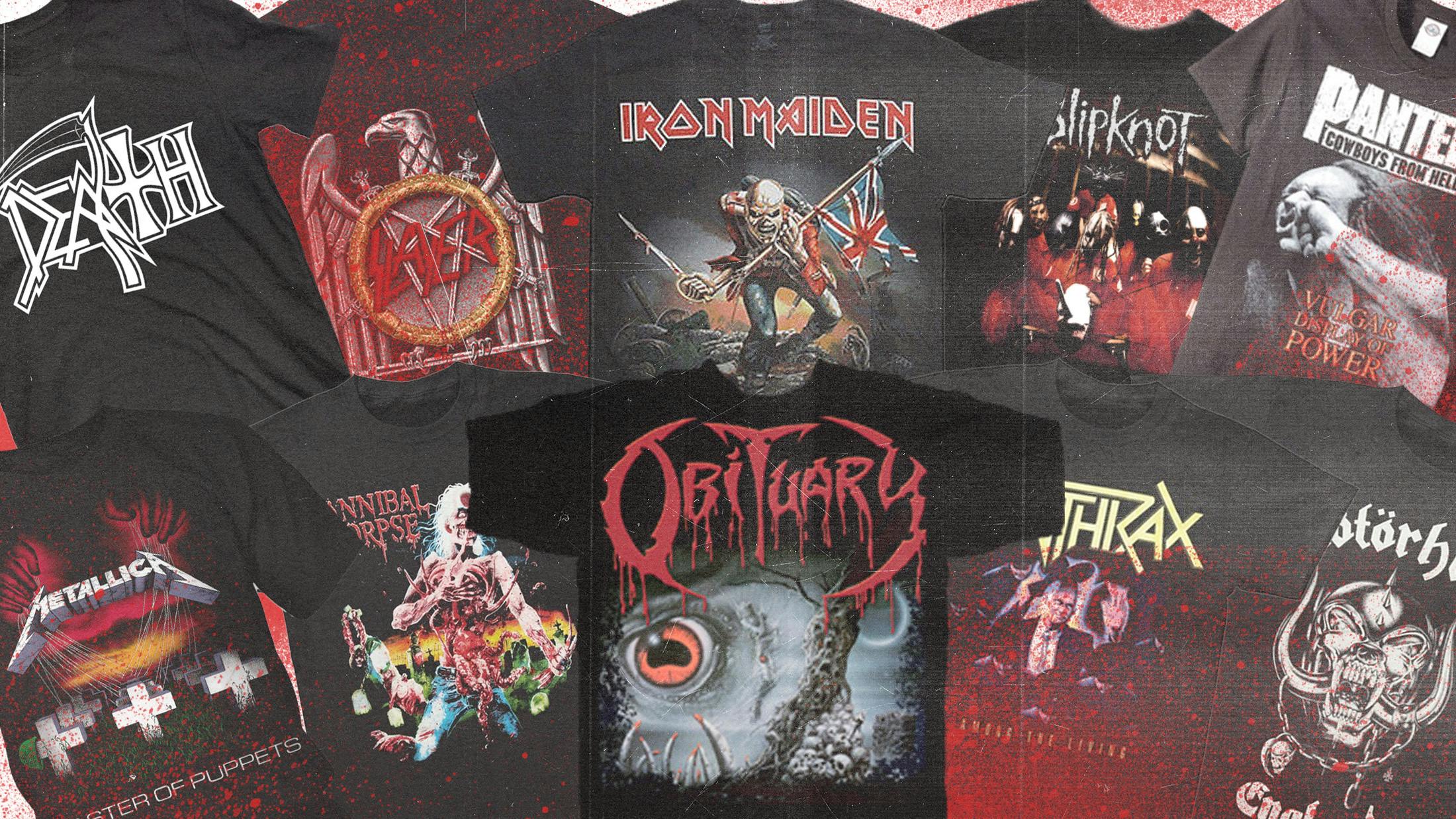
Cause Of Death is Obituary’s second album, and the only one to feature guitarist James Murphy (Death, Testament, etc.). Released in 1990, the album featured artwork by Michael Whelan, who’s designed for hard rock and metal bands ranging from Evile, to Meat Loaf, to Sepultura. In fact, the Cause Of Death design was actually supposed to be used for Sepultura’s Beneath The Remains – but the band’s label, Roadrunner Records, thought it would be better for the Florida death metal act. Michael Whelan’s Eye Of Cthulhu was inspired by the cosmic entity featured in H.P. Lovecraft’s short story The Call of Cthulhu – and closer inspection reveals a mummified human figure in the close watch of the creepy, oversized eye. The artwork is a fittingly brutal representation for one of the most brutal death metal bands of all time.
If you don’t recognise Snaggletooth right off the bat, chances are you’ve never left the house. The illustrated character was birthed by artist Joe Petagno when Lemmy approached him with the task of designing a logo for Motörhead. Petagno took the idea and ran with it, perusing through old biker patches and eventually staring down the long end of some real animal skull research. The image he ended up with was a hybrid beast: part dog, part gorilla, part boar. Lemmy’s dream was for ol’ Snaggle to become a symbol that unites those who wear it: a uniquely feral, badass biker patch found on jackets and vests (T-shirts, too!), grabbing the attention of terrified passersby. And to this day, it’s still just that. Good job, Joe.
No metal fan’s wardrobe is complete without repping Among The Living. Released on March 22, 1987, some would call this album the peak of the first wave of thrash metal. Dedicated to Cliff Burton of Metallica, who had passed away in a tragic bus accident while on tour with the band in Sweden, the album’s art was designed by Master Of Puppets illustrator, Don Brautigam. And as with Puppets, the concept for the image was developed by a band member: Anthrax drummer Charlie Benante wanted a design that inferred that evil is all around us – hence the many identical static figures surrounding one glowing individual. Oh, and here’s a little known fun fact to enlighten others when you’re rocking your AtL shirt: Caught In A Mosh was inspired by Scott Ian witnessing one of the band’s techs being pulled into the pit!
This shirt featuring the album artwork from Mexican-American metal band Brujeria’s 1993 debut record Mantando Güeros is one to avoid wearing if you’re planning to stop by your grandma’s place later in the day. It features an image taken from Mexican tabloid ¡Alarma!: a photo of a burnt and severed head – a victim of the narco wars – held up by someone out of shot. The perfect accompaniment to the album’s themes of drug trafficking, satanic rituals, sexuality, migration, illegal border crossing, and Anti-Americanism. This head is now referred to by the band as "Coco Loco" and is used by them as a mascot and logo.
You don’t have to hear Slipknot to know what they sound like. When the masked nonet first appeared together on the unsettling cover of their 1999 self-titled debut, fans instantly knew that heavy metal would never be the same. The legendary Dean Karr – as adept at shooting rock bands like Slayer, Iron Maiden, and Slipknot as he is at shooting sharks – was the mastermind behind the image. And while not much is known about the 1998 shoot, YouTube does have some grainy, low quality footage of the band and the photographer at a carnival. What matters most is that this album and the T-shirt on which its cover is printed have become indispensable staples for any metalhead living in the 21st century.
Originally a giant backdrop mask the band would hang during shows, Iron Maiden’s mascot Eddie eventually made his way to paper thanks to artist Derek Riggs. Eddie has always taken on different forms from album to album – but this particular version of Eddie debuted in 1983 with the release of Piece Of Mind, to accompany the song Trooper (based on the Charge of the Light Brigade at the Battle of Balaclava in 1854, for all you history nerds). Bruce Dickinson can be found waving that Union flag around on stage during most performances, and has recently amped this up a bit by wearing a red coat uniform for the song. In lieu of a flag and coat, the classic T-shirt featured here is the next best thing for any Maiden fan to don.
True Norwegian Black Metal! Whatever you think of all the stuff that happened around that scene, that’s a line-in-the-sand, scorched earth, year zero, fuck you of a slogan, and it belongs on a shirt in gothic lettering of some kind, absolutely no question. The phrase first appeared on the sleeve of Darkthrone’s fourth album, 1994’s Transilvanian Hunger, and has been co-opted as a rallying cry by many Norwegian bands since then. There are many different versions of this shirt, but our feeling is the bigger and bolder the print of the slogan, the better.
We’ve got an eye-grabber, here! Or… is it eye-eater? Another classic album cover printed onto apparel, Eaten Back To Life is amongst the gnarliest on this list – certainly with the gnarliest artwork, drawn with love by comic book artist Vince Locke (Deadworld, A History Of Violence). The image on this nauseating shirt depicts a zombie gingerly snapping off his own ribs to get to his intestines. Why? He’s hungry, of course! On a related note, the album was “dedicated to the memory of Alferd Packer, the first American cannibal (R.I.P.)". (For those who don't remember: Packer had come back from a group trip to the Colorado mountains entirely by himself, confessing to having used some of his colleagues’ remains as food to survive the trip back. Unlike the depiction on the shirt, however, he did not eat himself.
Master Of Puppets is Metallica’s third album – the cover of which is among their most iconic. Though the final image was drawn by illustrator Don Brautigam, the original sketch was created by James Hetfield. Brautigam (who is best known for his work on Stephen King novel covers) then worked over the sketch and made it his own; if you look closely at the bottom right corner in the grass, you can even see the initials D.B. As many Metallica fans know, Master Of Puppets is a reference to drug use (i.e. “puppet” users being controlled by a “master”). Papa Het, of course, has been very open about his bad habits; re-entering rehab last year after 17 years of sobriety.
Vulgar Display Of Power is the gnarliest album Pantera ever released – accompanied by the gnarliest album artwork of all-time. Pantera hired photographer Brad Guice to capture the image of a dude getting punched in the face – surely, in part, to reflect the band’s goal of playing harder than anyone else out there. While late, great drummer Vinnie Paul had erroneously claimed that the band paid the poor cover model for 31 punches (at a mere $10 per punch) to get the shot just right, the truth is that Guice actually hired a model who was never punched at all. In fact, the photo was staged and manipulated to look like a brutal attack. Still, the image is one of the most intense and iconic in all of heavy metal, and makes for a killer t-shirt that sends a clear message: keep back.
Death has one of the most recognisable logos in all of metal. Though founder and sole consistent member Chuck Schuldiner would politely argue otherwise, the band is undeniably responsible for establishing death metal as we know it today. And though Schuldiner would take flak for eventually incorporating traditional and progressive elements into his music, such innovation would inspire various sub-genres and bands now thriving in 2018. As with all Death-related things, Schuldiner came up with the band’s logo design, too – which originally included an upside down “T” to portray an inverted cross, but was adjusted in ’91 for the release of Human, to distance itself from religion. Good thing, too, for fashion’s sake – as it makes this T-shirt design all the more universal, though still super badass.
Cradle Of Filth’s most iconic merchandising effort features the image of a masturbating nun on the front with the phrase “Vestal Masturbation,” and the words “Jesus Is A Cunt” in giant, unapologetic lettering on the back. First released in 1993, this shirt spent the ’90s as a lightning rod for arguments about freedom of speech in the newspapers, was the cause of many arrests for public indecency, and no doubt many, many “you’re not leaving the house wearing that”-themed arguments with parents. A judge once ordered one of these shirts to be destroyed, and it’s the only shirt on this list that Rolling Stone have profiled, so this is an inarguably cool garment. Maybe just don’t wear it to mass.
As the greatest Satanically-tinged thrash metal band of all-time, Slayer has never shied away from controversy. While claims have been made that the eagle in the band’s logo is similar to the one often found in conjunction with the Nazi swastika, Slayer has attested time and time again that they have no interest in promoting any Nazi agenda – but they’ve always been fascinated by evil-looking shit. This famous Slayer design made its debut alongside the release of 1990’s Seasons In The Abyss, but the font in which the name of the band is written was developed much earlier in 1981, when designer Blake Edwards first sketched it out for his close friend, guitarist Kerry King. It has since been converted into a downloadable computer font known as “Slaytanic,” and etched into human arms. In conjunction with a pentagram, swords, and eagle, it is the ultimate heavy metal logo.